I want to redesign my main Blaugustine blog and
would love to get some feedback from
everyone who visits there regularly or occasionally or
even if you just happened to drop in for the first time.
What do you think of the new header?
Is it an improvement or not? What about the sidebars?
The colour scheme? Should I change the entire structure?
Any suggestions at all?

Since I still haven't been able
to restore commenting over there, please post your comments below. Thank
you!
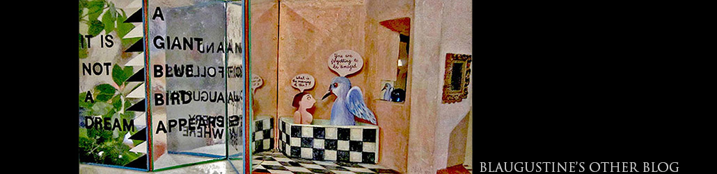
MORE
9 comments:
Natalie, I saw your lovely redesign yesterday but haven't had the time to comment until now. I love your banner image, it's so you! I thought the colours were somewhat subdued for you but I liked it because the posts stood out.
Now I see it's changed again. The black background on the banner is very striking, but personally I think the red on the sides is a bit too bright and distracting, maybe a darker red? Perhaps it is just my computer, or my eyes.
I must say, Natalie, I admire your ability to design your blog pages. I depend on more computer savvy family members to help me. I'm sure whatever you decide on in terms of design and colours it will be great, it will be Natalie's.
And good luck with the comment function, I know that is frustrating you, but at least you have the second blog, clever you!
Marja-Leena, many thanks. I've been playing around with the colours and haven't decided anything yet. I agree that the red is distracting - I guess it reminded me a bit of ancient Egypt - so it will have to go. Maybe the whole thing needs a radical rethink - get rid the table structure?
I like it. If the two "U"s had been the same I would have suspected something along the lines of Sherlock Holmes' "Dancing Men" code!
Hi Natalie
Exciting that you are redesigning! I'm no designer or typographer, but for what it's worth, I think BLAUGUSTINE should feature more strongly - can each of your dancing 'you's jump on a letter?
Also - when you're reading a web page, there's a kind of hierarchy of information. We tend to read the header first, then the welcome/new news, then the menu to follow through on information. Having the menu split makes me feel a bit nervous, that I'm not being guided through the site. My attention is jumping from one side to the other - which is why I guess most blog home pages have a menu to one side. You've probably done that not to privilege one link over another, but the risk is the reader doesn't click on any...
Like your other commentator, though, I'm wowed that you take on this task yourself, and make such an amazing job of it - and I LOVE the dancers too!
Dominic, thanks very much. I'm afraid the header has changed again since you first saw it and now my scattered letters have vanished! I'm not sure what I'm going to try next but obviously it's not quite right yet.
Alison, you're quite right. One of the things I'm trying to improve is that there's just too much going on and too many links to follow. Most of it is already on my home page (the main website) so I guess I don't really need it on the blog. Aaaaargh, too much to decide!
I do like the dancing Blaugustines and the low-key title, but would suggest a font change to something a little more striking and maybe expanded. Re the sidebars, maybe unframed and again an alternative font? But then I'm a font freak and have hundreds in my folder that I can only use within Photoshop!
Dick,thanks. Yes I agree that the sidebar links could be unframed. At present I'm using Skia and Georgia typefaces but will try some others. I tend to prefer simple unadorned ones and have deleted quite a few from the vast font list in Photoshop and elsewhere!
I find eyecatching headers distracting. Even on blogs featuring artwork I prefer a plain format.
Hattie, I've only just seen your comment.
Thanks, I agree with you. I'm now thinking that all the dancing figures are too much. Back to the drawing board!
Post a Comment